Build a Hands-Free Selfie Android Application with MediaPipe
Introduction
Set up the Development Environment
Manage Camera Permissions
Integrate MediaPipe solutions
Manage UI state with ViewModel
Use SharedFlow to View Events
Use StateFlow to View Controller States
Mediate flows to trigger photo capture
Avoid duplicate photo capture requests
Next Steps
Build a Hands-Free Selfie Android Application with MediaPipe
StateFlow is a subclass of SharedFlow and internally uses SharedFlow to manage its emissions. However, it provides a stricter API, ensuring that:
- It always has an initial value.
- It emits only the latest state.
- It cannot configure its replay cache (always
1).
Therefore, StateFlow is a specialized type of SharedFlow that represents a state holder, always maintaining the latest value. It is optimized for use cases where you need to observe and react to state changes.
Expose UI states in StateFlow
- Expose two
StateFlows namedfaceOkandgestureOkinMainViewModel, indicating whether the subject’s face and gestures are ready for a selfie.
    private val _faceOk = MutableStateFlow(false)
    val faceOk: StateFlow<Boolean> = _faceOk

    private val _gestureOk = MutableStateFlow(false)
    val gestureOk: StateFlow<Boolean> = _gestureOk
- In this demo app, you will focus on smiling faces and thumb-up gestures. Append the following constant values to
MainViewModel’s companion object:
        private const val FACE_CATEGORY_MOUTH_SMILE = "mouthSmile"
        private const val GESTURE_CATEGORY_THUMB_UP = "Thumb_Up"
- Update
onFaceLandmarkerResultsandonGestureResultsto check if their corresponding results are meeting the conditions above:
    override fun onFaceLandmarkerResults(resultBundle: FaceResultBundle) {
        val faceOk = resultBundle.result.faceBlendshapes().getOrNull()?.let { faceBlendShapes ->
            faceBlendShapes.take(FACES_COUNT).all { shapes ->
                shapes.filter {
                    it.categoryName().contains(FACE_CATEGORY_MOUTH_SMILE)
                }.all {
                    it.score() > HolisticRecognizerHelper.DEFAULT_FACE_SHAPE_SCORE_THRESHOLD
                }
            }
        } ?: false

        _faceOk.tryEmit(faceOk)
        _uiEvents.tryEmit(UiEvent.Face(resultBundle))
    }
    override fun onGestureResults(resultBundle: GestureResultBundle) {
        val gestureOk = resultBundle.results.first().gestures()
            .take(HolisticRecognizerHelper.HANDS_COUNT)
            .let { gestures ->
                gestures.isNotEmpty() && gestures
                    .mapNotNull { it.firstOrNull() }
                    .all { GESTURE_CATEGORY_THUMB_UP == it.categoryName() }
            }

        _gestureOk.tryEmit(gestureOk)
        _uiEvents.tryEmit(UiEvent.Gesture(resultBundle))
    }
Update UI in the view controller
- Navigate to the
strings.xmlfile in yourappsubproject’ssrc/main/res/valuespath, then append the following text resources:
    <string name="condition_indicator_text_face">Face</string>
    <string name="condition_indicator_text_gesture">Gesture</string>
- In the same directory, create a new resource file named
dimens.xmlif it does not exist already. This file is used to define layout related dimension values:
<?xml version="1.0" encoding="utf-8"?>
<resources>
    <dimen name="condition_indicator_padding">12dp</dimen>
    <dimen name="condition_indicator_margin">36dp</dimen>
</resources>
- Navigate to the
activity_main.xmllayout file and add the following code to the rootConstraintLayout. Add this code after the two overlay views which you have just added in the previous section:
    <androidx.appcompat.widget.SwitchCompat
        android:text="@string/condition_indicator_text_face"
        android:id="@+id/faceReady"
        android:layout_width="wrap_content"
        android:layout_height="wrap_content"
        android:layout_margin="@dimen/condition_indicator_margin"
        android:padding="@dimen/condition_indicator_padding"
        android:background="@color/white"
        app:layout_constraintStart_toStartOf="parent"
        app:layout_constraintBottom_toBottomOf="parent" />

    <androidx.appcompat.widget.SwitchCompat
        android:text="@string/condition_indicator_text_gesture"
        android:id="@+id/gestureReady"
        android:layout_width="wrap_content"
        android:layout_height="wrap_content"
        android:layout_margin="@dimen/condition_indicator_margin"
        android:padding="@dimen/condition_indicator_padding"
        android:background="@color/white"
        app:layout_constraintEnd_toEndOf="parent"
        app:layout_constraintBottom_toBottomOf="parent" />
- Finally, navigate to
MainActivity.ktand append the following code inside therepeatOnLifecycle(Lifecycle.State.RESUMED)block, after thelaunchblock.
This makes sure each of the three parallel launch code sections run in its own co-routine concurrently without blocking each other.
                launch {
                    viewModel.faceOk.collect {
                        viewBinding.faceReady.isChecked = it
                    }
                }

                launch {
                    viewModel.gestureOk.collect {
                        viewBinding.gestureReady.isChecked = it
                    }
                }
- Build and run the app again. Now you should see two switches on the bottom of the screen as shown below, which turn on and off while you smile and show thumb-up gestures. Good job!
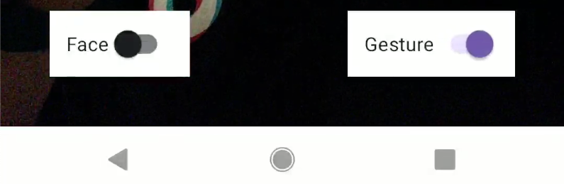 Figure 8: Indicator UI.
Recap on SharedFlow vs StateFlow
This app uses SharedFlow for dispatching overlay views’ UI events without mandating a specific stateful model, which avoids redundant computation. Meanwhile, it uses StateFlow for dispatching condition switches’ UI states, which prevents duplicate emission and consequent UI updates.
Here is an overview of the differences between SharedFlow and StateFlow:
| SharedFlow | StateFlow | |
|---|---|---|
| Type of Data | Transient events or actions | State or continuously-changing data |
| Initial Value | Not required | Required |
| Replays to New Subscribers | Configurable with replay (for example, 0, 1, or more) | Always emits the latest value |
| Default Behavior | Emits only future values unless replay is set | Retains and emits only the current state |
| Use Case Examples | Short-lived, one-off events that should not persist as part of the state | Long-lived state that represents the state of the current view |